CHALLENGE:
Makor's primary focus is a customizable B2B software product, Makor ERP, that brings the power of data and process to the complicated and regulated business of IT asset management.
In my word of interactive design, we wish every company would have the latest computers with the latest browsers so we could put on the best show. When desktops, laptops, servers, phones and other electronics are replaced though, there is still value in the "reletively new," older equipment.
There is a niche industry to deal with this and Makor provides software for that industry that is by far and on every front the most comprehensive, powerful, proven and customer supported choice.
Makor faced a problem; the tactics of a few newer competitors in their space with weak, unproven products. These competitors were bringing modern websites, bolder materials, talking big... and taking sales from Makor. This is a business communications challenge with real dollar consequences.
Our objective for Makor was to step up their game with an effective brand platform in the digital and live space that matches the superior quality of their product. Also to be more clear and bold about who this is for and why this is the best choice.
BEFORE:
10 years ago I helped Makor Solutions with a new logo, business cards and a unique website with seamless animated Flash banner. Not too shabby, but we all agreed it was time to step up and over the competition.
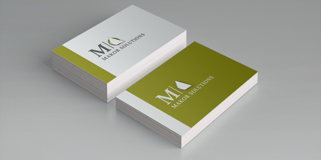
LOGO 2008: The 3 documents jutting out toward you in 3D space represent the technology "solutions" Makor is generating.
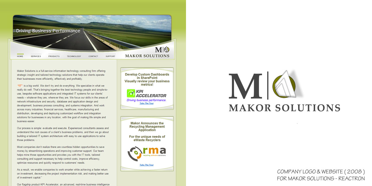
LEFT: The top of the site was in Flash. With smart planning you can't tell where the Flash area and the HTML area meet - Can you? Hint: The page links are 100% HTML.
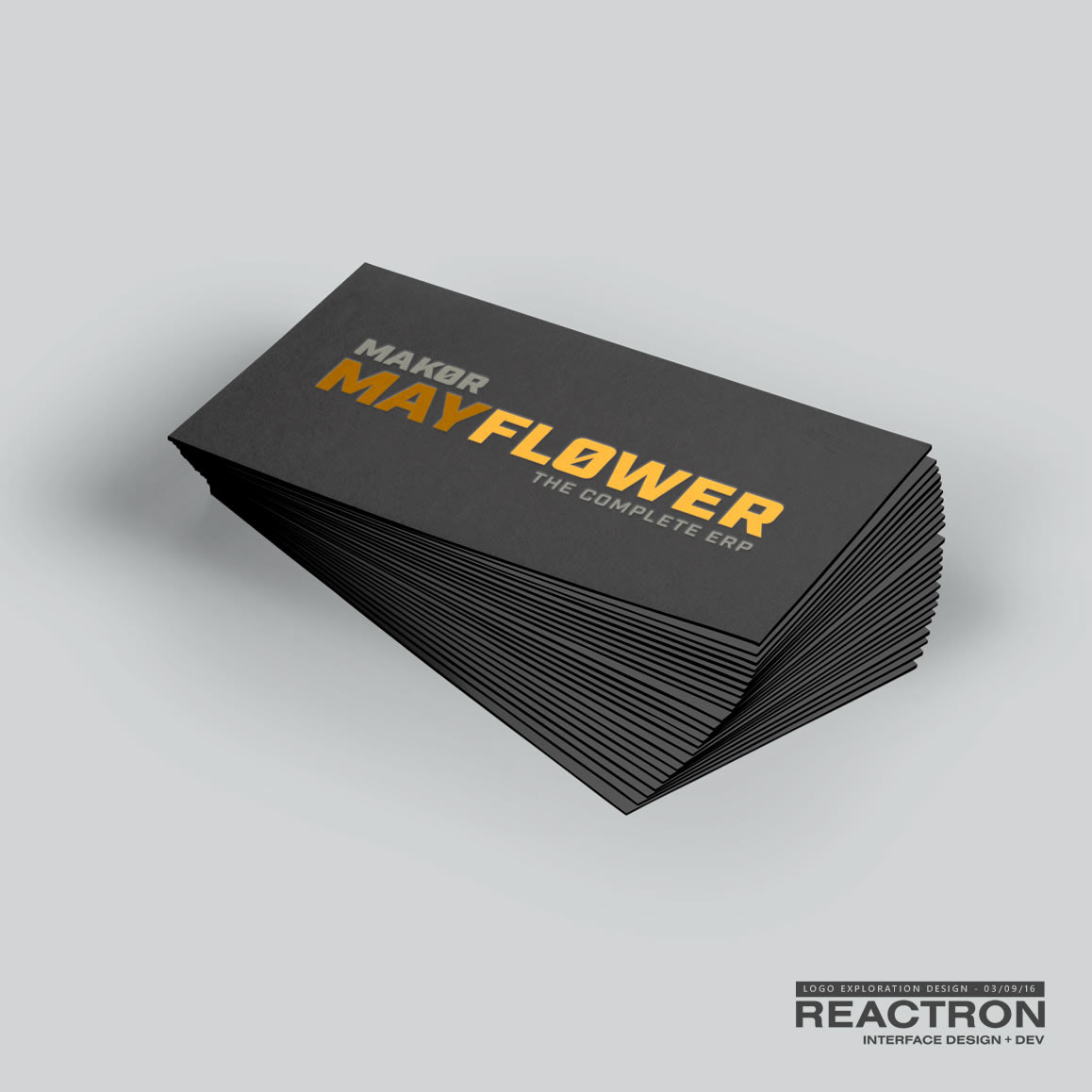
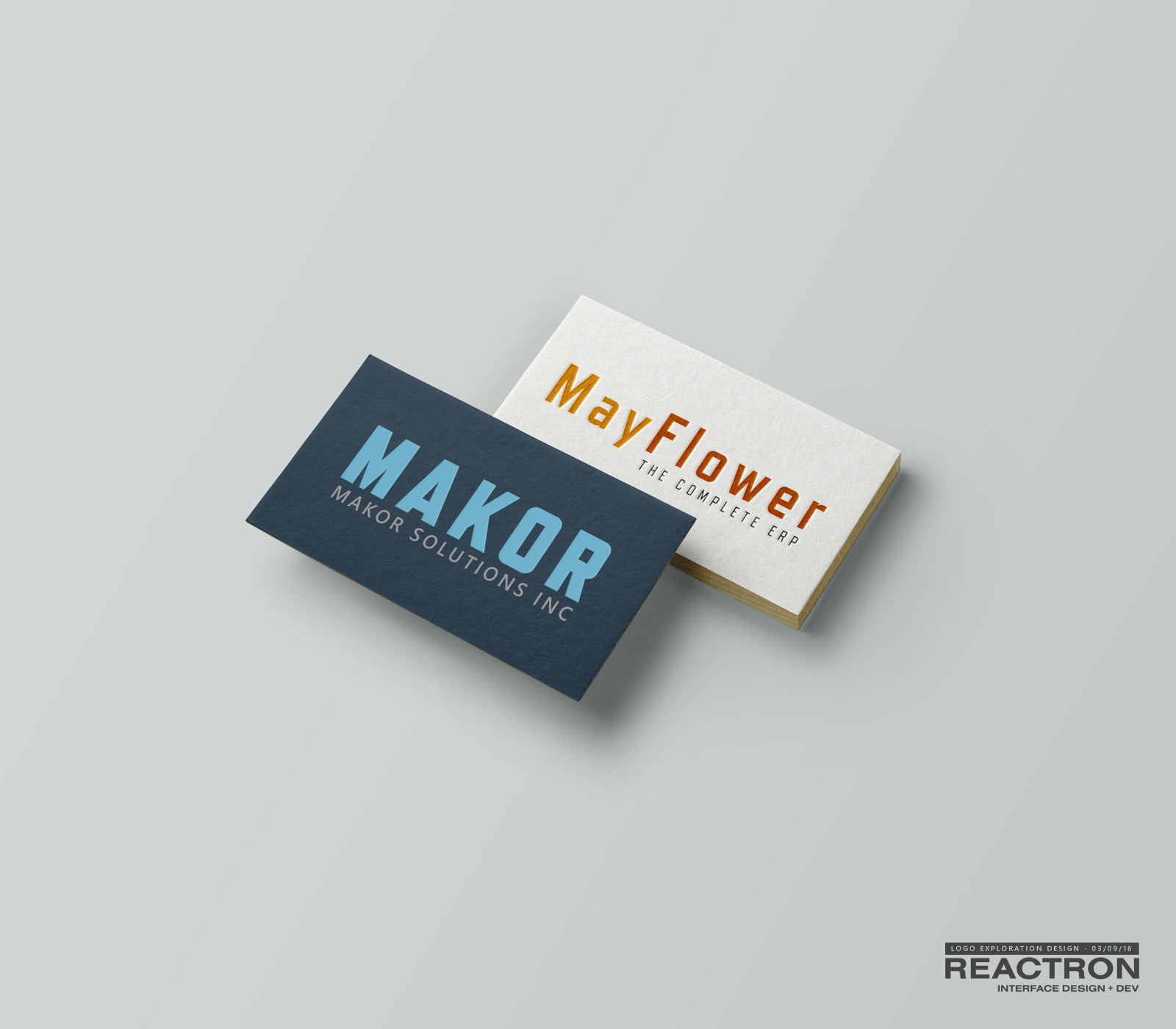
CONCEPTS: BRAND AND PRODUCT LOGOS
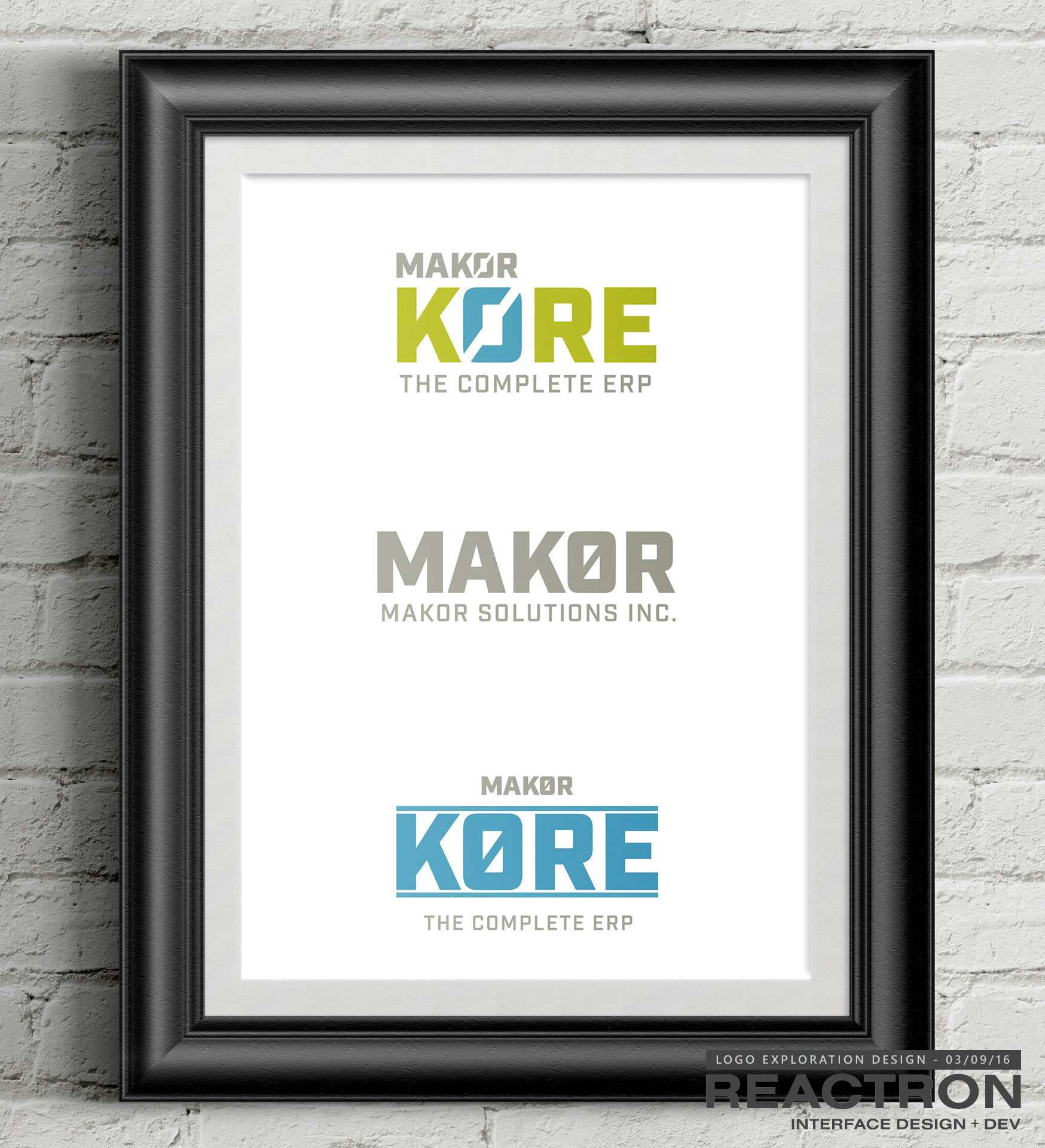
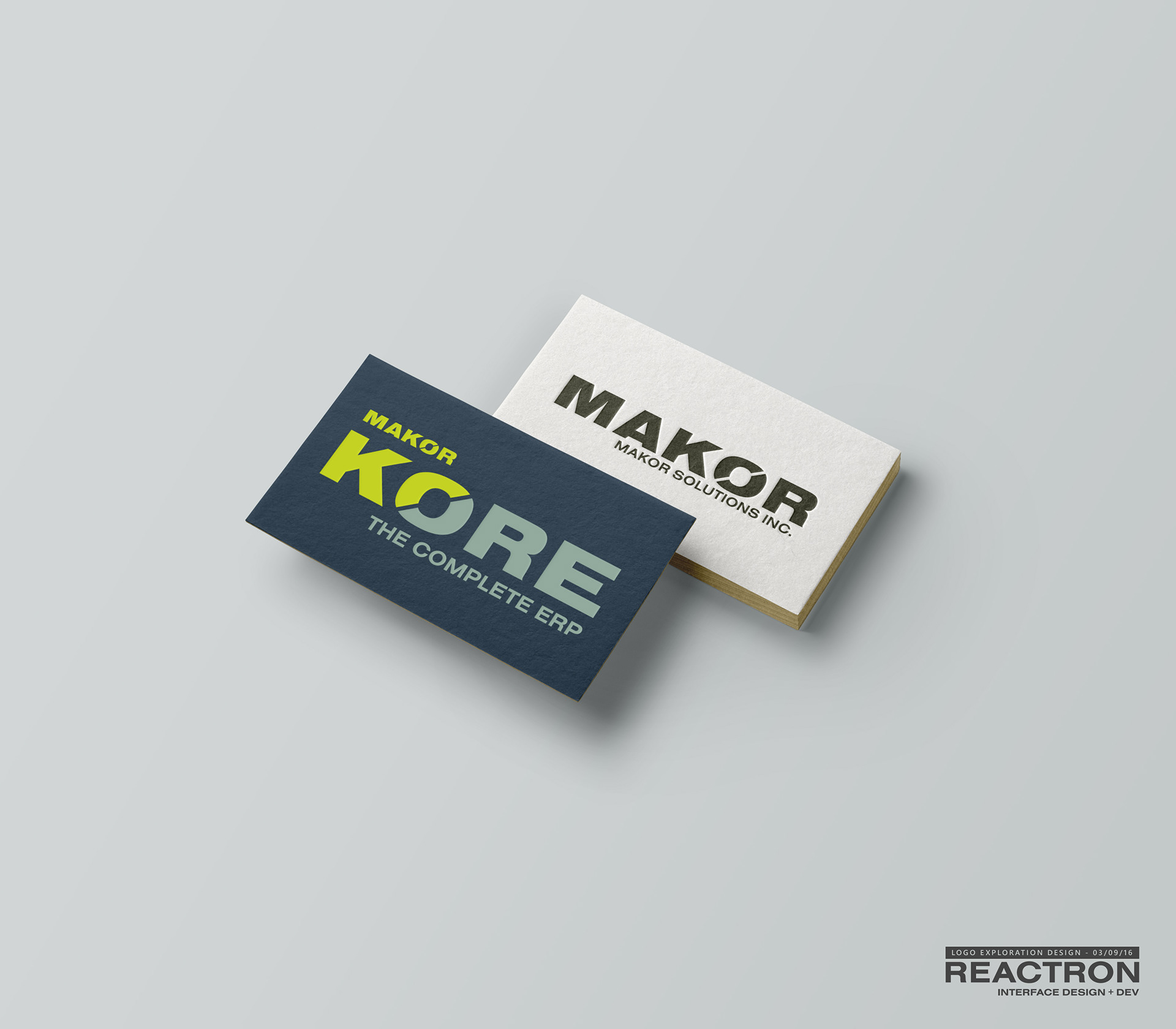
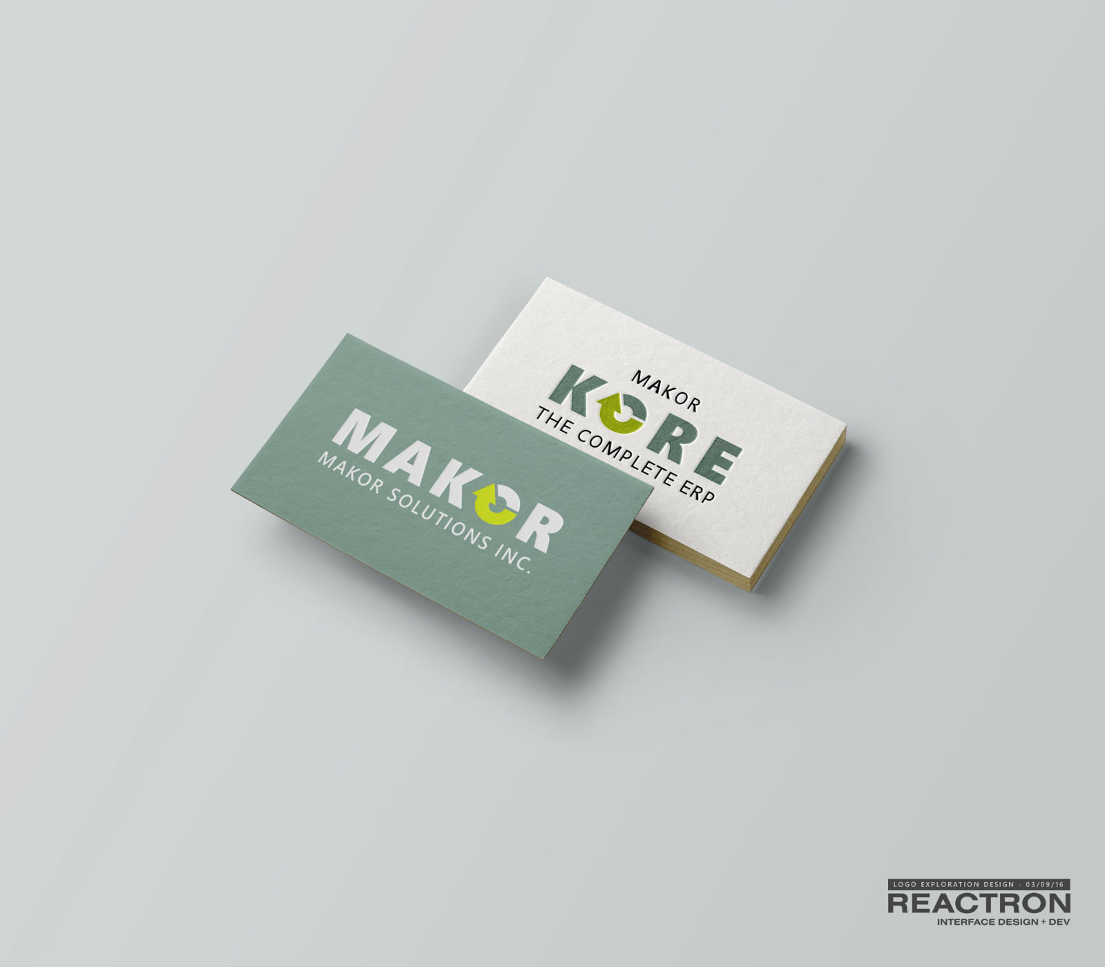
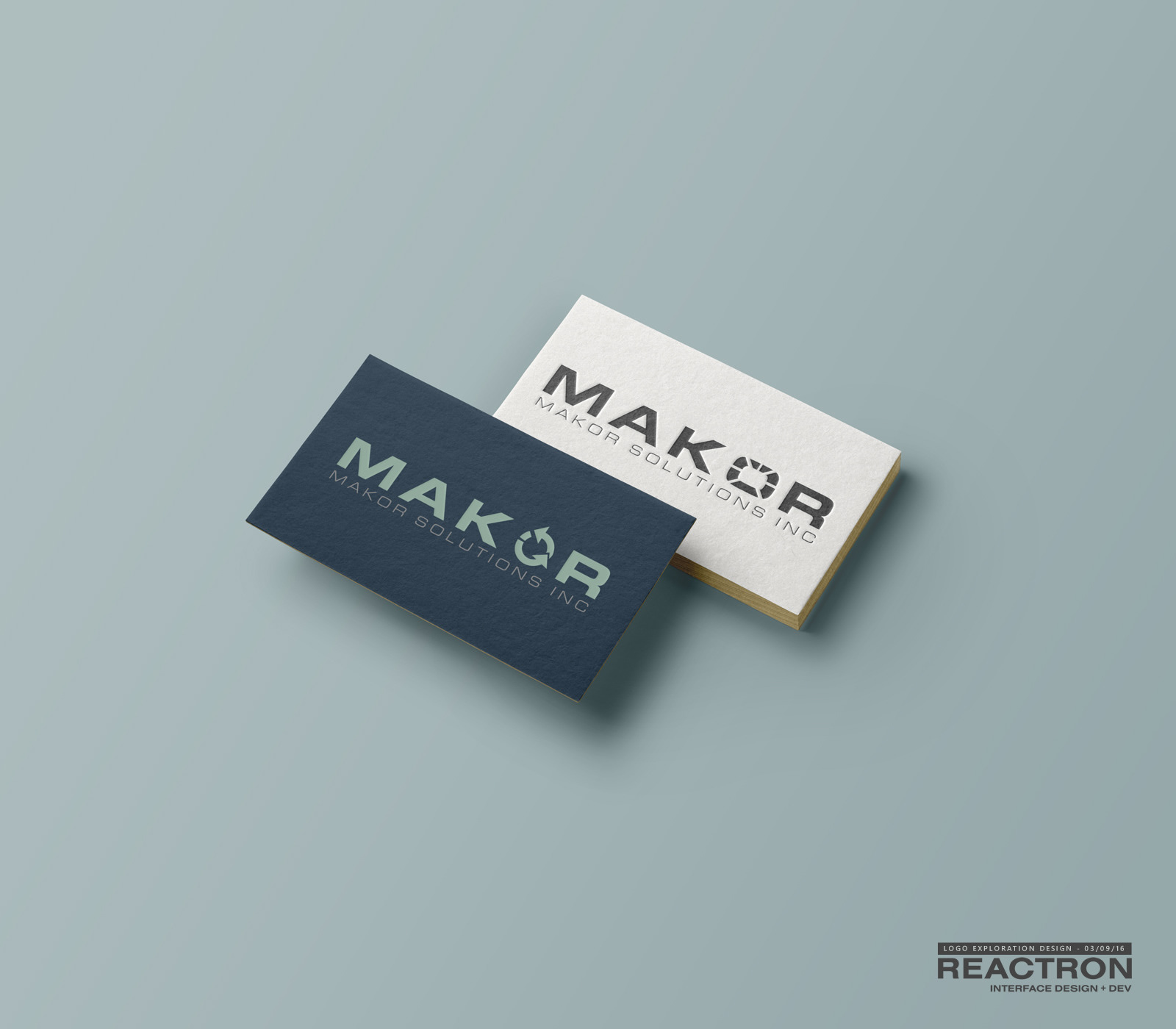
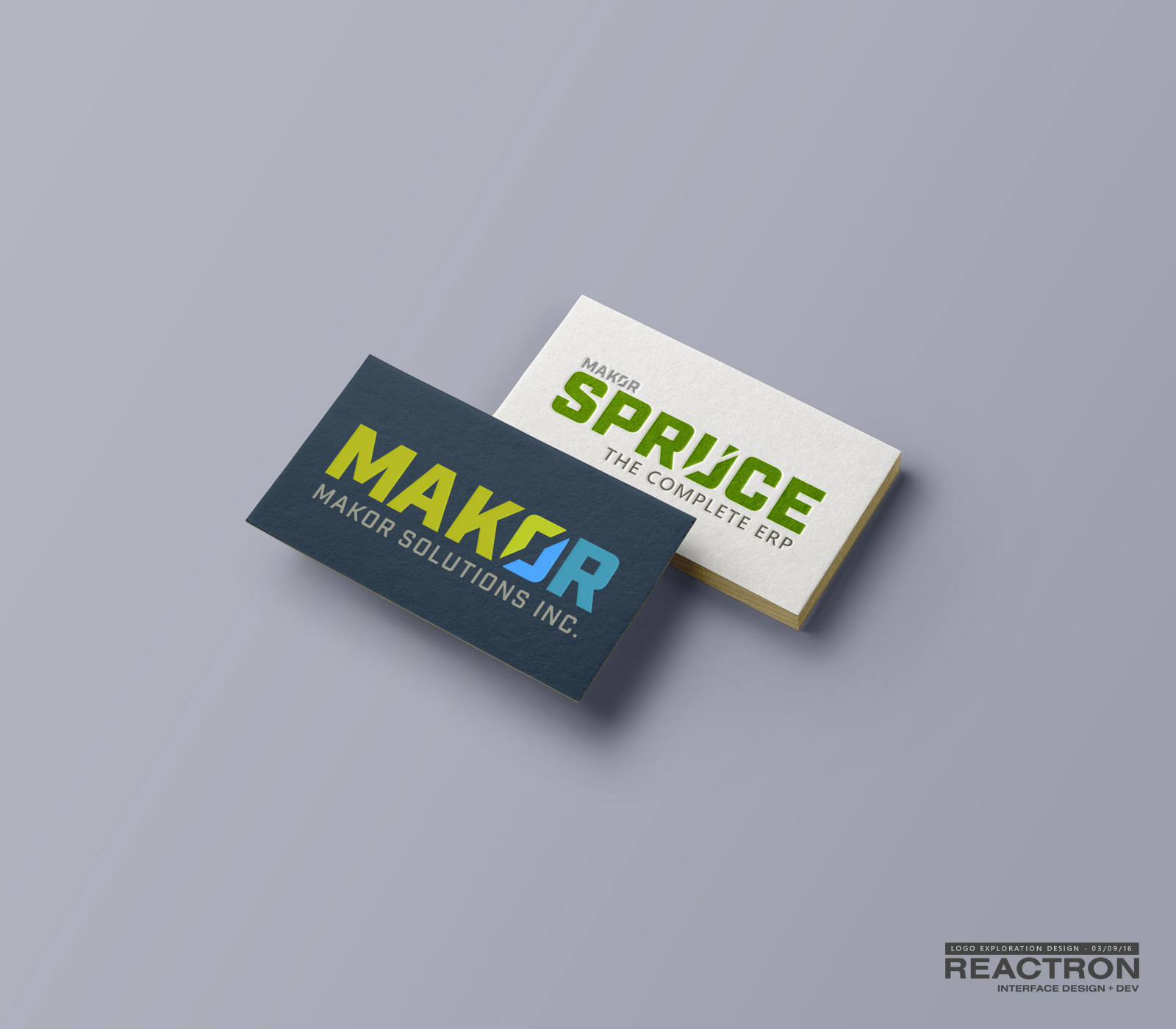
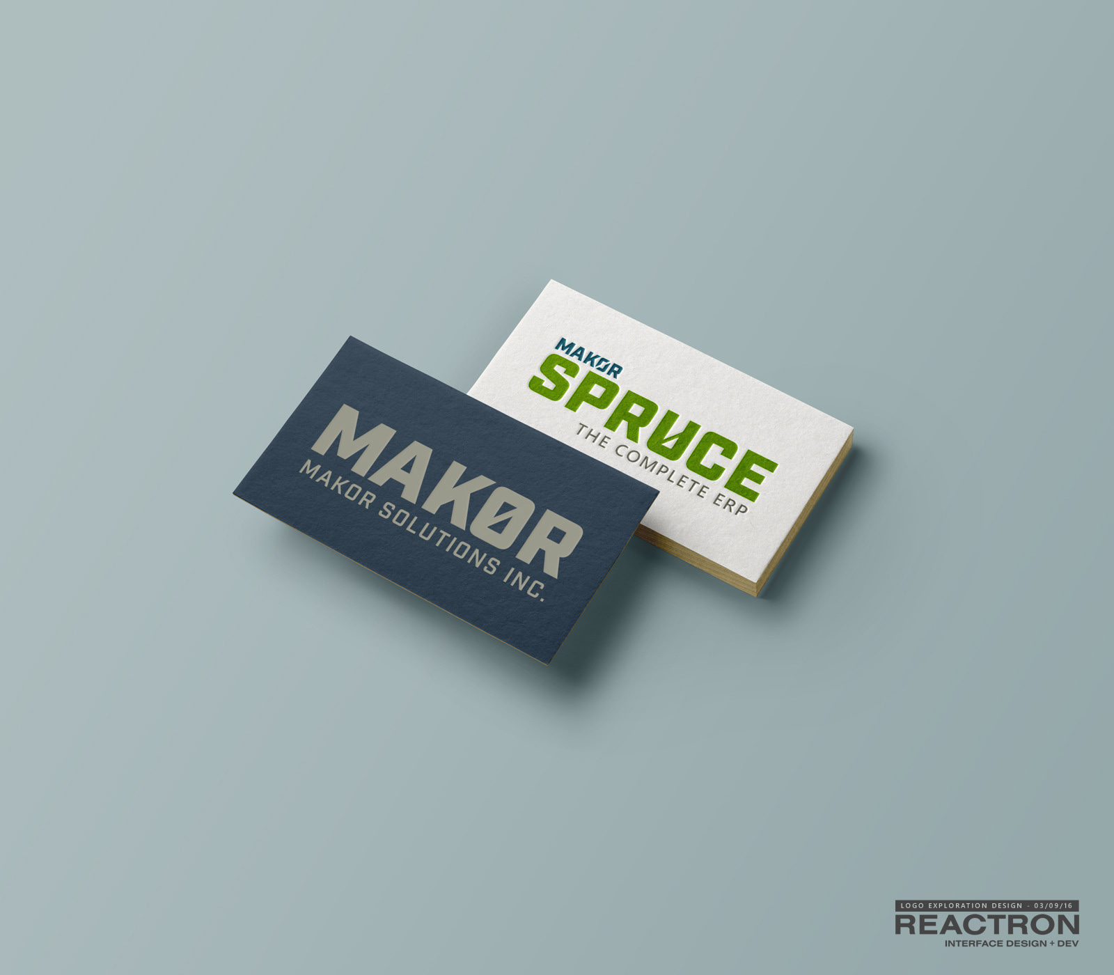
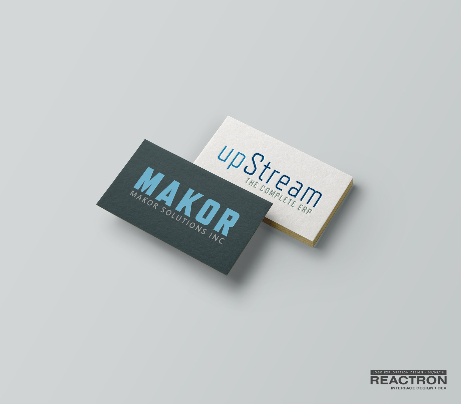
WINNER:
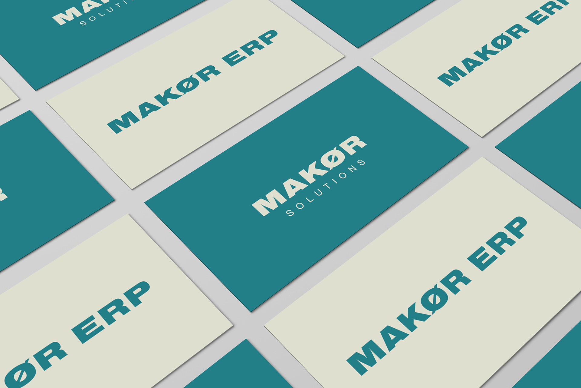
A key to logo design is to stay on shape first; black on white, or in this case; blue on white. One the shape is solid, you can get crazy with color choices. While it's more rare these days, there are still times when you need a single or reverse color version of the logo. We're set.
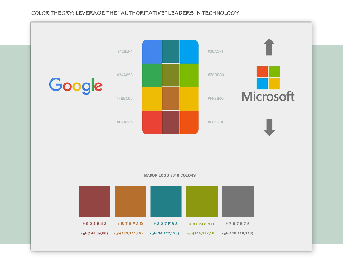
COLOR THEORY:
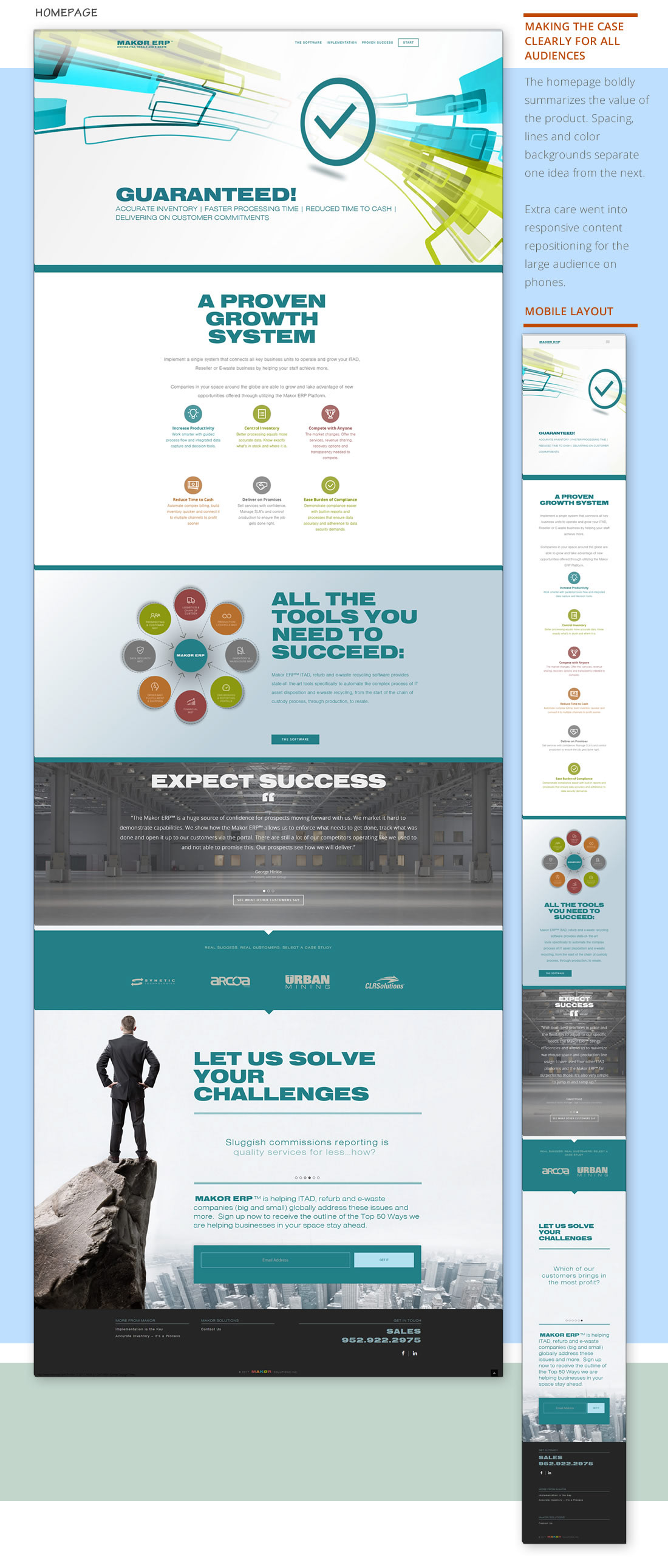
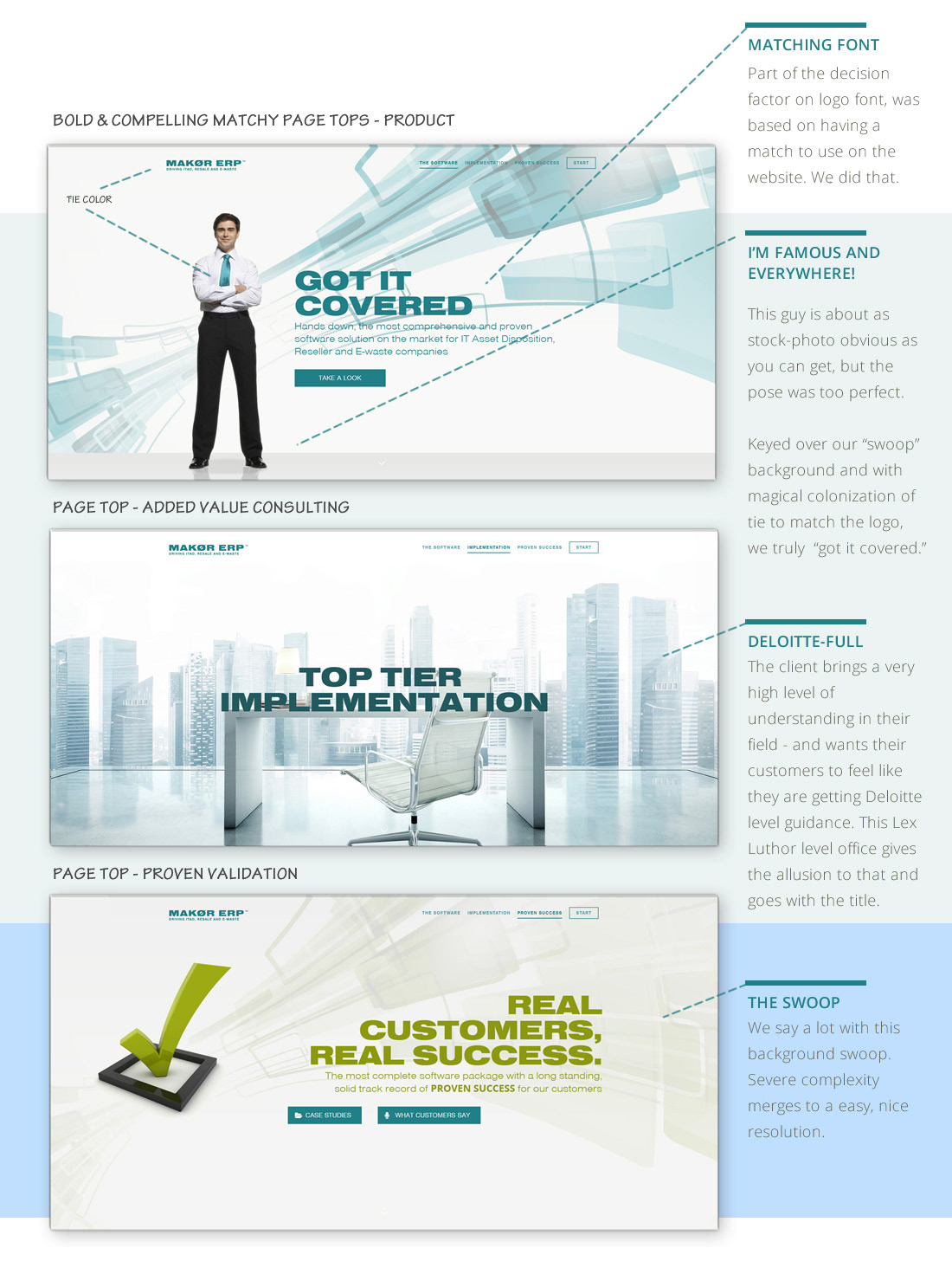
NEW WEBSITE HIGHLIGHTS:
The client wanted a single color for the product logo. Watch how we were able to use the parent brand colors for the design of inline graphics on the website.
MATCHING TRADE SHOW BOOTH DESIGN:
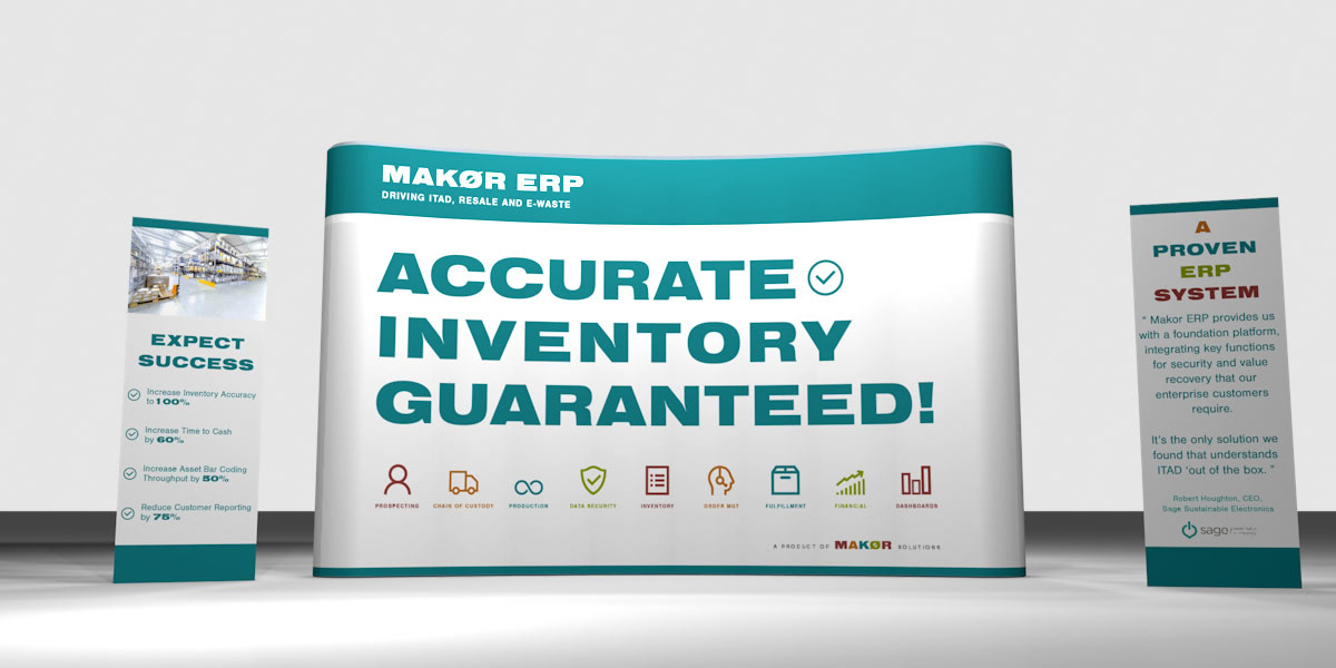
Note the consistency: Blue primary color, Makor accessory colors and attribute icons. When there is more time, I'd like to "relight" this 3D scene. It looks like it should be realistic, but is off. Why? Lighting.
RESULTS:
Just in time for a key annual trade show - Makor showed up now confident their strong message and brand materials matched their leadership position in the space.
"We are being presented in a professional, mature light – and that is exactly what we are. " - Mark Chodos, CEO
Visit project at www.makorERP.com